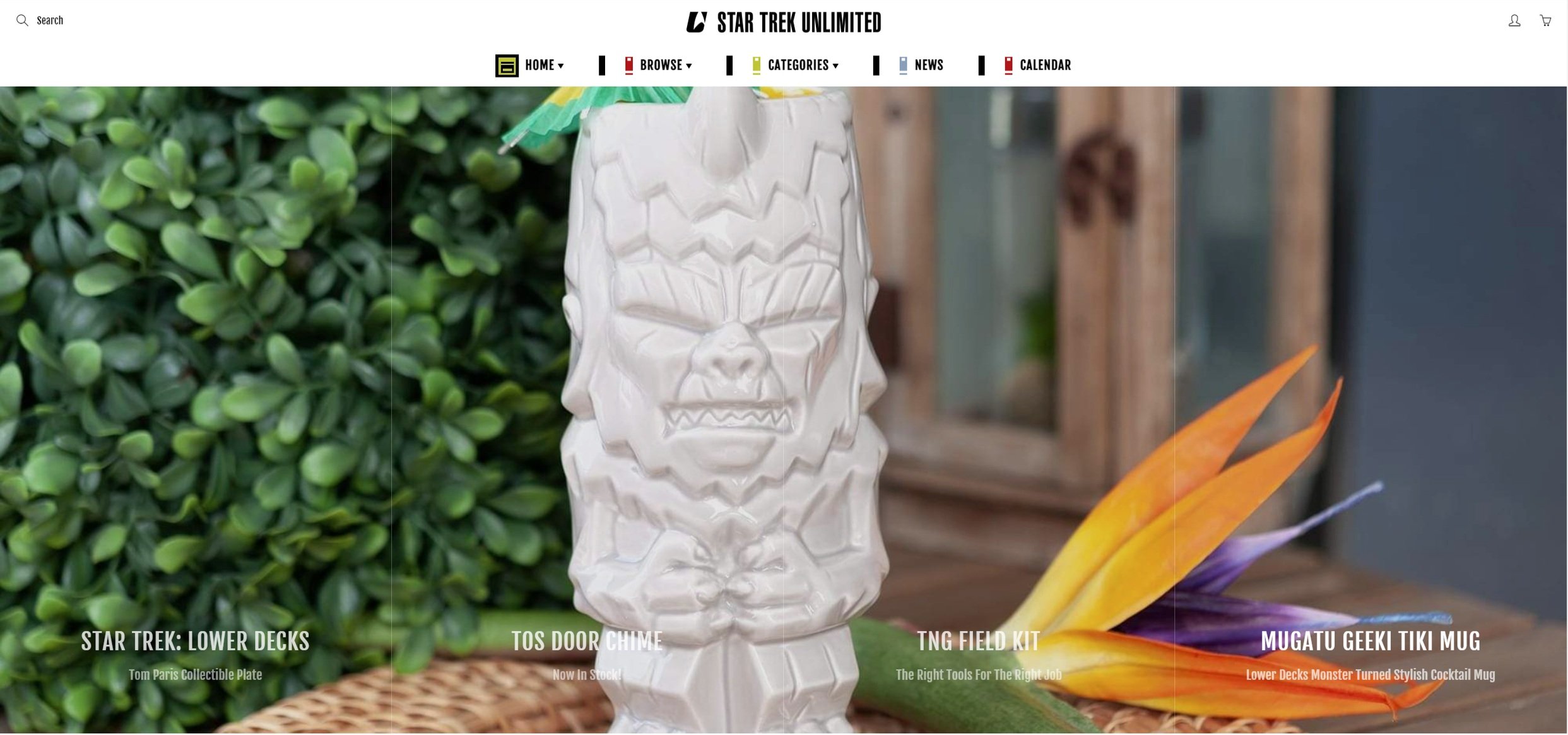
Building a brand from the ground up.
The site navigation needed to honor the history and many diverse series within
the Star Trek canon while reflecting the current geek culture aesthetic.
Color Story
What makes Star Trek so iconic? I thought a good place to start with creating a web brand for something as recognizable as Star Trek could use specific colors to help aim the categories of product that we wanted to sell and tie in the legacy of the iconic brand.

Wireframing
I used a wide range of color stories to create different looks for the web pitch. I gave each a unique title to cement the story behind each layout. The client loved the integration of the isolinear chips with the neutral-toned version of the original series color scheme for a classic look that could support colorful product image overlays.


Logo Ideation
Multiple rounds of logo ideation trying to find the best combination of images. I initially pursued a ‘U’ shape the mimicked Spock’s hand sign for ‘Live Long and Prosper’. This symbol, however, pales in comparison to the silhouette of the starship Enterprise or the iconic badge emblem which was ultimately the direction we took the logo.


